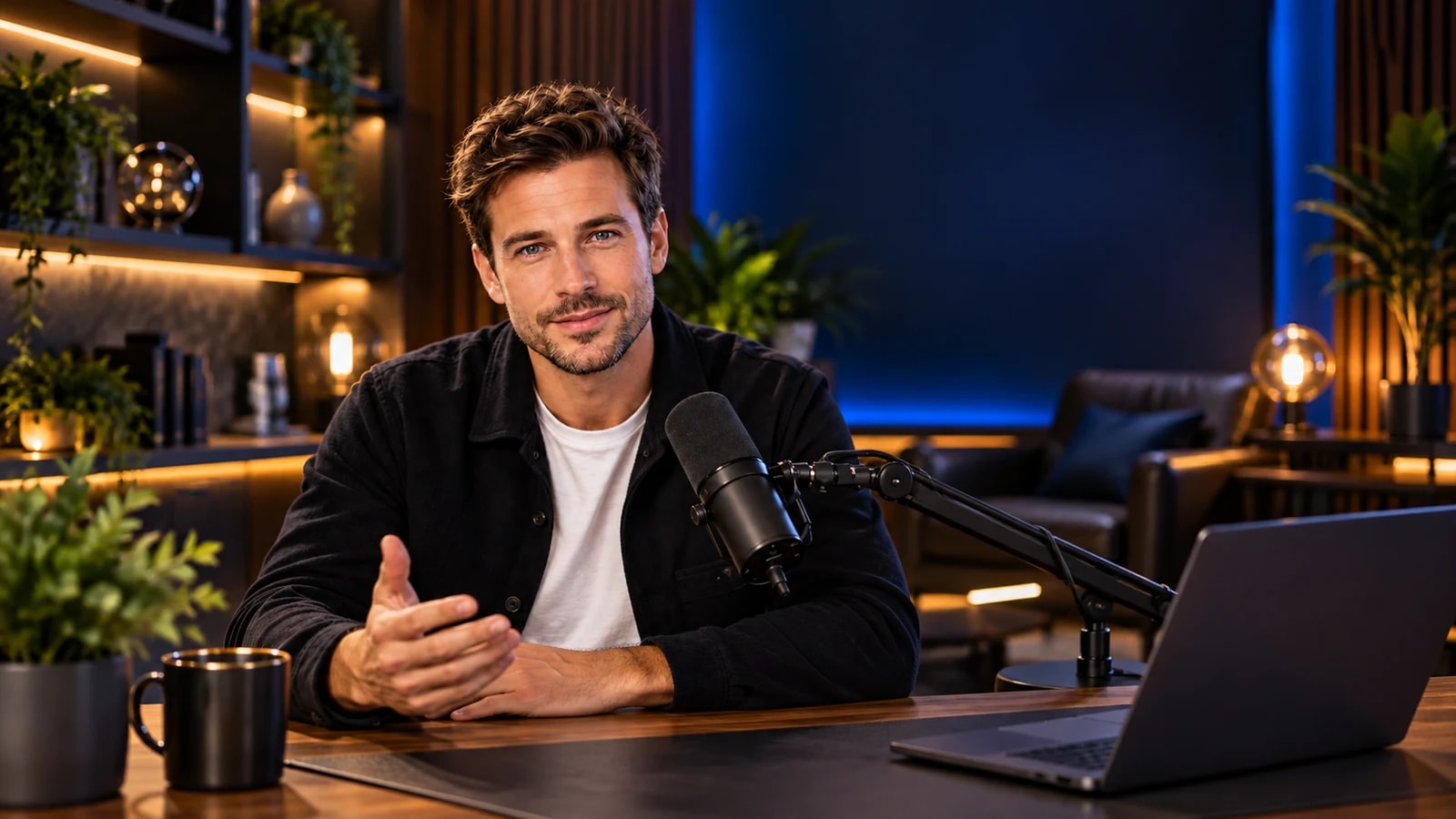

Someone lands on your live halfway through. In the first few seconds they need three answers: whose show is this, who is talking, and why should I stay? Live stream branding answers all three without you saying a word.
Here is how to build a look that works, with the tools you have in Studio Go.
Start with a brand kit
A brand kit is the set of choices you make once and reuse on every show. In Studio Go it is saved for your platform, so every show starts on brand:
- Your logo, in one of three placements. A version with a transparent background looks cleanest.
- Your brand colour, used across the on-screen elements.
- Fonts: 14 to choose from, Arabic included.
- Name-tag style: five styles, from plain to bold, or hide the names entirely.
- Backgrounds, overlays and stickers to finish the frame.
Pick one colour and one font, and resist adding more. Consistency reads as quality.
Where to put your logo
A logo in a corner works like a TV channel’s mark: always there, never in the way. Keep it small enough not to cover faces, and choose a corner your lower thirds do not use. If your lower thirds sit at the bottom, a top corner is the safe choice.
Lower thirds people can actually read
The lower third (the name and title under a speaker) is the most useful graphic in a live show. Three rules make it work:
Keep it short
A name on the first line, a short role on the second: “Sarah Adams · Head of Product”, not a full biography. If a title needs two lines, it needs editing.
Preview it privately first
In Studio Go every text item can be previewed where only you see it. Check spelling, line breaks and the fit with your layout before it goes on air.
Show it at the right moment, then let it go
Show a guest’s lower third when they first speak, and again after a break. Set a timer and it hides itself, so you never forget it on screen.
Banners and tickers: when to use which
A banner carries one message you want people to act on: “Send us your questions in the chat”, “New episode every Thursday”. Show it when it is relevant, not for the whole show.
A ticker scrolls a line of information along the screen. It suits the things people can read while they listen: the topic of the day, a schedule, a sponsor’s line. Keep each item short, and avoid running a ticker and a banner at the same time.
Free text covers everything else, like an episode number or a hashtag.
Media that matches your look
Your intro, break and outro videos are part of your branding too. Use the same colour and logo, and keep them short: ten to twenty seconds is plenty. On the media board you can put up to four videos or images on stage at once, docked into the layout or floating on top. See every studio tool.
Templates: brand once, reuse forever
Once a show looks right, save it as a template. Your logo, colours and fonts stay with your platform, and the next show starts from the same look in a click. If you run several formats, keep one template per format.
A quick branding checklist
- Logo with a transparent background, in a corner that never covers faces.
- One brand colour, one font, one name-tag style.
- Lower thirds written and previewed for every speaker.
- One banner per call to action, shown only when relevant.
- Intro, break and outro videos that match the look.
- The whole look saved as a template.
Branding questions
Can I change graphics during the live?
Yes. Text items are shown and hidden live, and layouts switch smoothly while you are on air.
Does branding work for Arabic shows?
Yes, Arabic fonts are included and the studio supports right-to-left. Our guide to going live in Arabic covers the details.
Every plan includes the brand kit and on-screen text. Compare the plans.